
The Meaning of Colors in Branding

Good color choices can evoke certain feelings and make content stand out or make it easier to read. Bad color choices can incite negative thoughts or even cause viewers to miss important information.
Basic Color Theory
Primary colors are Red, Blue, and Yellow
Secondary colors are Purple Green and Orange (because they are created by combining primary colors)
Tertiary color take secondary colors one step further and have hyphenated names like yellow-green, red-orange, blue-green, etc.
Cool colors are on the right side of the colors wheel (blue, green, purple) while warm colors are on the left (yellow, orange, red)

Contrast
While high contrasting colors are best for highlighting important information, too much can be overwhelming and the effect is lost. Tone on tone is more pleasing to the eye, but some content may not be as highlighted as needed. It’s a delicate balance.
To make certain items stand out the most, choose complementary (opposite) colors on the color wheel. For example red/green, yellow/purple, blue/orange. One color must be the dominant one while the other is only the highlight. An important note to remember, green and red are often the colors not seen well by people with color blindness.
You may also decide on 3 or even 4 color combinations, just space them out on the wheel accordingly (green/orange/purple or green/blue/yellow/red - think Google’s logo).
Logo Colors and Their Meaning
Color is a powerful tool and can invoke feelings, memories, and reactions. Because a color can immediately draw someone in or make them turn away, color is an important decision when creating a logo that represents your business.
The simple fact is that color is perceived by everyone differently because of their own experiences although there are some universal reactions about certain colors. Here are some common interpretations of colors. This is not the definitive guide, merely general knowledge.

Red
Red is high energy, attention-getting and represents strong emotions. Red is good for creating a sense of urgency (like a sale), or encourages appetite (fast food sales). Since it is such a powerful color, use it sparingly.
Red is the warmest of all colors and most popular among extroverts and males. It can represent passion, energy, love, desire, and determination. Studies show it can raise blood pressure and boost appetites.
Red is the color to use if you really want to grab attention with CTAs like “Buy Now” or “Click Here”
Common Uses: sales, food, energy drinks

Orange
Orange is adventurous, creative, and represents motivation. It can bring comfort or a sense of freedom. Orange is often associated with autumn, harvest, and sports but also invokes compassion, warmth, and understanding.
Like red, orange can also stimulate hunger or thirst
Common Uses: sporting events or products, food, drinks
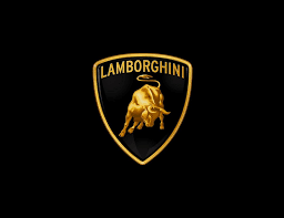
Gold
Gold represents luxury or treasure and is strongly associated with wealth, success, and knowledge. It's a confident color that attracts confident brands. While a gold logo is all about prestige and high status, it can also appear egotistical or self-righteous.
Common Uses: luxury or beauty products
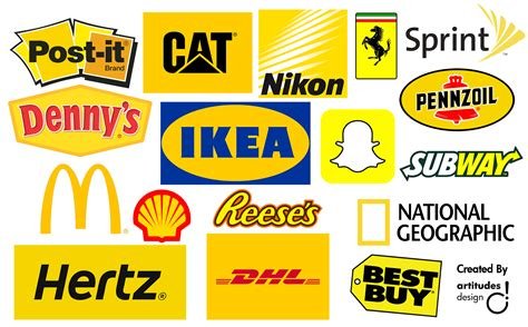
Yellow
Yellow is cheerful, represents sunshine, and portrays a happy, fun spirit. Like the color red, it can also invoke opposite feelings of stress, impatience, isolation and more. It can represent happiness and wealth as well as greedy and toxicity. It is a complicated color so use carefully!
Common Uses: food, automotive

Green
Green is nature’s favorite color for a reason: it balancing and reflects new beginnings and health. Green is used to promote relaxation. While there are some minor negative connotations (envy, materialism), green mainly promotes a balance of the logical and emotional.
Common Uses: restaurants, health products, nature

Blue
The color of water and sky, blue is calm and soothing and represents trustworthiness. It is the preferred color of both men and women and is often used by conservative brands attempting to promote trust.
Not all shades of blue represent loyalty, sincerity, or confidence. Some icy shades of blue can feel cold or unfriendly while too much blue can invoke melancholy or negativity.
Common Uses: spas, hospitals, doctors, banks (Chase, Citibank, Barclays, Bank of America)
Turquoise represent clarity of thought, good communication, and welcoming
Uses: consulting, communication (Motorola, Twitter)

Purple
Purple is inventive and represents wealth, mystery, and creativity. Combining the fiery elements of red with the calming influences of blue, purple or violet symbolizes spirituality, passion, power, nobility, and luxury.
Women tend to like purple more than men. Be aware that an abundance of purple can be distracting so use this powerful color sparingly.
Common Uses: royalty, luxury items, spiritual or fantasy

Pink
Pink is youthful and represents compassion or hope. Pink suggests a female-focused product or service starting with baby products all the way up to adult female-based marketing. While most brands that use pink do target females, there are a few outliers that use pink to draw attention by not using a more common color.
Be aware that using too much pink can be draining or reflect immaturity.
Common Uses: child products, feminine products, bathroom products, cancer-related products

Black
Black is authoritative and reflects power and control. Black is the absence of all color and can cause conflicting feelings. While black suggests strength, sophistication, and elegance it can also represent aggression, evil, and even death. It can boost confidence and induce feelings of emptiness.
When using black with a logo, it must have a strong, clear shape that clear reflects your business as there are no other colors to help convey the message.
Common Uses: sports, automotive, luxury brands, technology

White
White is simplicity and represents order, purity and new beginnings. Because white represents cleanliness and purity, white space can help with creativity like a clean slate.
Be aware that too much white can invoke isolation and emptiness.
Common Uses: technology, sports, creative products

Gray or Silver
Gray is neutral and is considered a solid, dependable color. Darker gray can feel depressing while lighter gray is uplifting. Some tones may feeling boring and not attract attention. ‘
Silver or metallic tones can signal luxury or technology but if not done well, metallic silver can look cheap and “tinny”.
Uses: technology, automotive, luxury brands

Brown
Brown is earthy and comfortable representing dependability and structure. It’s a very serious color when black is too much but it can be considered boring.
Brown is traditionally the least favorite color of both men and women
Common Uses: chocolate, food, home furnishings, coffee shops

Multicolor
Multicolor branding can invoke a complicated set of emotions depending on the colors selected. Think of the in-your-face logos from McDonald’s or Burger King with their vibrant reds and yellows, or Google’s, Nascar’s or NBC’s rainbow hued logos.
Common Uses: exuberant, dynamic, energy brands
Your Branding Colors
So, what is the right color combination for your product or services? While you won’t be able to predict everyone’s reaction, there is enough research to be able to judge a potential consumer or client’s reaction to certain colors.
Overall, bright or warm colors promote action but make time go slower while softer or cool colors are better for mental activity and time flies.
Both men and women favor blue the most and brown the least
Orange and yellow are disliked more as both genders age, can be perceived as “cheap”, but still considered fun
Blue, white or green are considered trustworthy
Text Color Combinations
If you have text heavy content, the best colors for readability is black on white. Other dark colors like navy blue also work.
While dramatic, dark backgrounds are not the best choice if you have large amounts of text as they can cause eyestrain over time. If you have an abundance of images and graphics, however, a dark background can be quite stunning as long there is a limited amount of text.
Ready to Learn More?
Please contact Charlotte’s Web Designs to find the perfect balance for your branding. I create custom logos, branding, and web design for small businesses with an eye on color, shape and design that truly reflects your business. Contact me for a free consultation.