Choosing the Right Fonts for Your Brand and Website
Choosing the right fonts for your business website is an important part of defining your overall brand. Every font has an individual look and invokes a different feeling. They are an integral part of setting the tone of your communication so using the wrong one can cause viewers to be not connected to the meaning of your content.
Font Colors
There should be good contrast between your font color and background at all times.
With a light background, black text on white background is simply the easiest text to read. Dark blue and varying shades of darker gray are also very good.
A dark background is sometimes needed to truly highlight images, invoke a certain feeling, or portray a level of professionalism or drama. While it is possible that large amounts of text on a dark background can cause eyestrain, a bright text on a dark background can work very well in certain instances. High-chroma colors such as yellow, green, cyan and magenta are best for black backgrounds especially for headings or important links. They offer a good contrast ratio without the eye fatigue which may occur with white text on a black background. Red, purple and blue on black do not have enough contrast and should be avoided.
There are some combinations that do not work well. Try to avoid colors that are too close together such as light blue on a medium blue background. Also, avoid having the overall too bright such as bright yellow on bright green.
The goal is to find color combinations that offer good readability while still accurately representing your brand. You can use the following online services to select a color scheme: www.color.adobe.com
Font Size
One of the most important features is the size. Small fonts are notorious for invoking a negative response. It can cause agitation and frustration as viewers attempt to read your content.
Your website should be all-device responsive meaning that the readability is as good on a smartphone as on a desktop. In fact, Google is now ranking websites with a better mobile experience higher than other. This is not always an easy task but here are some good guidelines to follow.
Body or overall text sizes should be about 16px depending on the font style. This should be still small enough for text heavy content but large enough for readability concerns on a mobile device.
If you need to have a secondary text for image labels, captions, etc, try to stay about 13x-14x. Any smaller and it will not be readable and any larger will be too close to the body text size and be confusing.
If you do have a text-heavy page, consider going larger to decrease eyestrain. 18px, 20px, or even larger may be more appropriate.
How Many Font Sizes Should I Have on a Website?
While creativity is applauded, too many font sizes will just confuse the viewer and search engines crawling your website. Usually 3-4 font sizes is enough to give you flexibility while maintain consistency.
You will want one header size font on every page (this is necessary for good on-page SEO. This can be any size but traditionally it is the largest font on the page as the header explains what the page contains not only to readers, but to search engines attempting to crawl your site.
You may add one or two additional sub-header sizes as needed. The size is usually less than the header size but more than the body size.
The body size is anywhere from 16px or higher depending on the layout and amount of text.
You may also have a wildcard font size. This can be used to highlight certain areas of the content, for labels or buttons, or other instances. Staying fairly consistent with the rest of the fonts will make your site look more professional.
Font Weight
Besides choosing the font itself, it is also important to choose the font weight. For example, the Montserrat font has 18 different weights to choose from, and each one gives a different feeling:
Bolder is not better. As long a there is good contrast, lighter typefaces usually tend to be more legible than heavier typesets. In several studies, it is found that the best character stroke thickness is approximately 18% of the font height.
Font Width & Line Height
Fonts can be normal, wide, or condensed. Generally, a wide letter is better for legibility compared to a condensed one. Depending on the font chosen, you may need to change the width accordingly. If the font is larger, such as in a header, you might want to decrease the letter spacing slightly.
Many designers prefer line heights to be approximately 1.6 times the height of the letter size. This gives a good, clean break between lines without looking too spacious. This is only a suggestion and different applications may warrant different spacing.
Font Styles
You can look at certain fonts and get an immediate impression: professional, artistic, quirky, demanding, modern, vintage, romantic, techno, scary, or just strange. Everyone perceives your brand differently based on their own experiences but there are ways to make your font represent your brand for the majority of viewers.
Serif Fonts
A serif is defined as is a small line or stroke regularly attached to the end of a larger stroke in a letter or symbol within a particular font or family of fonts. Serif fonts are traditional, practical and the most reliable of fonts. They are clear, easy to read, and good for longer amounts of texts on a website or printed materials.
Some of the most popular ones include Garamond, Merriweather, Georgia, Baskerville, Didot or Roboto.
Serif fonts can be broken down into 4 sub-categories:
Old Style (Garamond, Goudy, Palatino)
Transitional (Times New Roman, Adobe Caslon Pro, Adobe Jenson Pro, Baskerville, Didot)
Didone (Libre Bodoni, Quiche, Cabrito, Abril Fatface, Rozha)
Slab Serif (Rockwell, Clarendon, Copse, Josefin, Museo)
While serifs are historically more legible and made a large difference improving the reading experience in print, they are not necessarily the smoothest online. Serifs are better used for titles or small amounts of text in a website.
Of all the serif font, Didone fonts are used the most often in web design. Still offering a distinctive flair. Didone fonts look more current than traditional serif fonts.
Sans Sarif Fonts
Sans (meaning without) Sarif fonts are modern and clean with almost a geometric flair. They are often used for large amounts of text as well as titles or logos. They work particularly well with small texts making them easier to read since they do not have added embellishments.
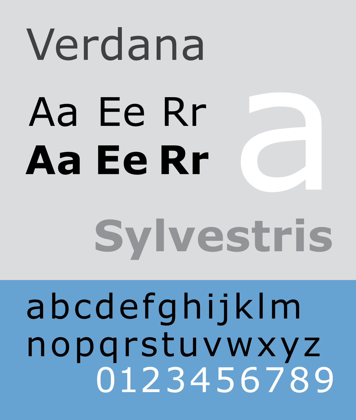
Some common Sans Sarif fonts include: Avenir, Futura, Gill Sans, Helvetic, and Verdana.
San-serif fonts can be broken down into 4 sub-categories:
Grotesque fonts are so named because they were perceived as crass compared to their ornate serif predecessors. Fonts without serifs were considered extremely rare and unappealing during the 19th century. Examples include Gotham, Dia, Trade Gothic, Akzidenz Grotesk, Franklin Gothic
Neo-Grotestque fonts are more modern versions of more traditional grotesque fonts. These relatively plain but very poplar fonts include: Arial, Helvetica, Univers, and MS Sans Serif.
Geometric Sans Serif fonts have a tell-tale geometric appearance making fonts appear more square or circular. Common examples include: Futura, Century Gothic, Spartan and ITC Avant Garde.
Humanist Sans Serif fonts look more hand drawn than other fonts with roots in calligraphy. They tend to evoke feelings of warmth and personality more than geometrics or neo-grotesque fonts. Some of the more popular humanist sans serif fonts include Adelle Sans, Freight Sans, Gill Sans, Optima, and Calluna Sans.
Script Fonts
Script fonts are sophisticated and stylish and are best used to express something that is formal or elegant. They are often used on invitations and website titles as well as logos. Rather than used in larger bodies of text, script fonts are more often used for short phrases or quotes.
Script font examples include: Lucida Calligraphy, Vivaldi, Monarda, Hope Sans, and Tahu.
Decorative & Display Fonts
Decorative & Display fonts are the most diverse and largest category of fonts. Rarely used for large sections of texts, decorative fonts are used for headlines, logos, or signage. Many reflect an aspect of culture (graffiti, tattoos) or a specific time period (psychedelic, grunge). They are creative and may have special features (like 3D, reverse lettering).
Like script fonts, decorative or display fonts should be used sparingly to avoid amateurish web design. Consider using them only in one spot or in a single portion of a headline.
Where to Find Professional Fonts
There are a number of free and paid sites that offer fonts. When downloading anything from the web, please ensure that you are using a reputable site. Here are a few favorites. Please be sure you always check the license conditions of any free font you download – many of the sites have different licenses for different fonts. While some are free for all uses, others are free for non-commercial use only.
Fonts Summary
Because of the complexity of font selection, it is best to keep font types down to a minimum in order to make a website page more pleasing to the eye. Here are some simple rules:
No more than four fonts on one page; two or three is best
Be mindful of contrasting colors when choosing a font color. Black on white is best for large amount of texts. Bright colors on dark are good for smaller areas. Avoid background and font colors that are too close.
Keep text large enough so that it is not frustrating for the reader.
Pay attention to font weight, width, and line height to ensure the best clarity.
Serif fonts are best in printed text since readers associate them with reliability. They can be used in headlines or areas where there is not a lot of text
Sans-serif fonts are best for main website text as they are clear without added embellishments.
Script fonts are sophisticated and stylish and are best used to express something that is formal or elegant. On a website, script fonts should be used sparingly.
Custom fonts, such as decorative and display fonts can make headlines and certain areas of text stand out. Too much, and your website will look amateurish.
Want to Know More?
5-star Google-rated Charlotte’s Web Design, LLC is a sole proprietor web design and digital marketing firm specializing in custom, professional websites, SEO, branding, logo design, digital marketing, content writing, and graphic design with over 35 years of technology experience currently working with over a hundred small businesses. Please contact me for a free consultation.


